Maeve of Connacht
Branding / Packaging
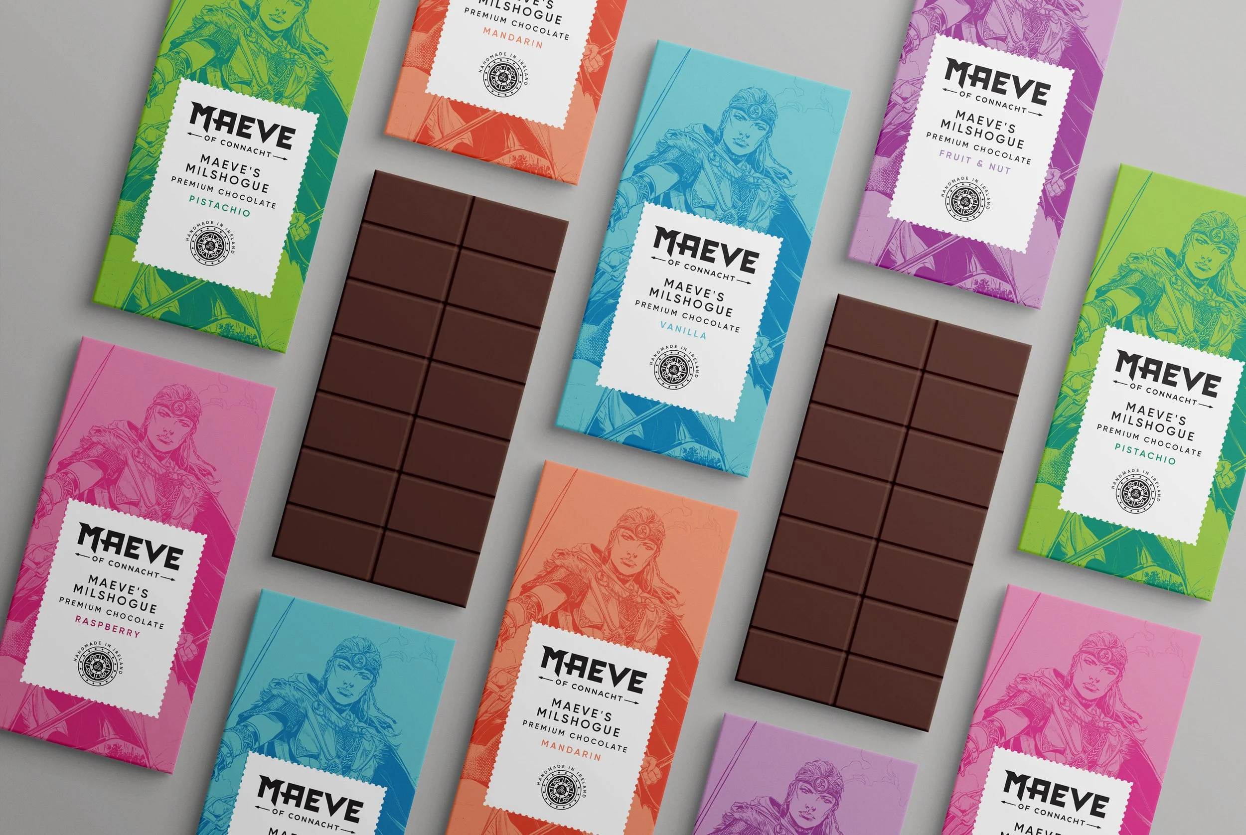
Many know Maeve of Connacht to be a legendary figure in Irish Mythology, she was a decisive forceful leader, an excellent warrior and her beauty was famous. But most know of her from her association with The Tain, which was the 'Cattle Raid of Cooley'. Maeve of Connacht is an animation story being produced by Ballywire Media. The illustration and story boarding had been done by illustrator Kevin Keane and it needed a strong brand identity which could work well across various platforms with the beautiful illustrations of Maeve.
My brief: was to design a brand identity for Maeve of Connacht to complement the illustration work and storyboards created by Kevin Keane. We wanted to create a brand mark which could sit alongside any modern day superhero brand identity. This brand identity was uniquely created and crafted for Maeve with an accompanying crafted Celtic shield which works very well in application on packaging. For the candle box packaging, I was aiming to create an elegant tone, with more muted colours accompanied by the floral illustration of the range of scents. A light shade on the front was contrasted by more darker tones on the side of the box. As a range they work really well as a family and the corrugated holding device used on the chocolate packaging transfers nicely to the candle boxes also.